Dashboard
The Dashboard gives a quick overview of tracked time and financial data.
Owners and Admins can view all data across teams, projects, and clients.
Users can only see their own tracked time for the projects they are assigned to.
You can switch between two tabs: Time and Money, depending on what data you want to review.
Time tab
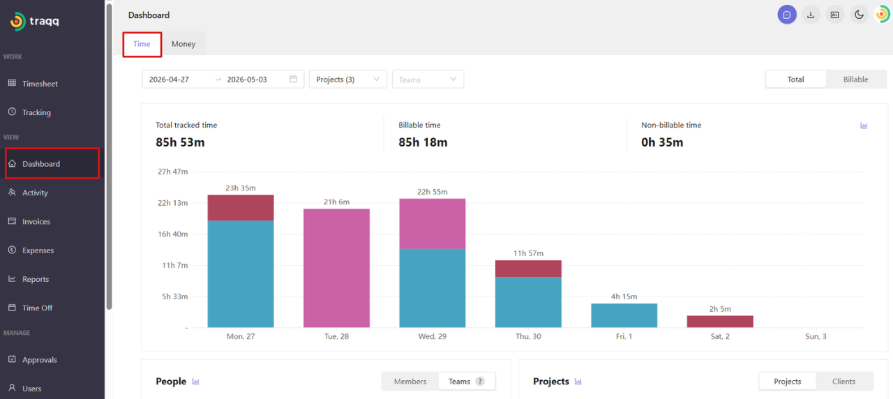
The Time tab shows how much time has been tracked within the selected period.
At the top of the page, you will see total tracked time, billable time, and non-billable time. A bar chart shows how time is distributed across the selected dates.
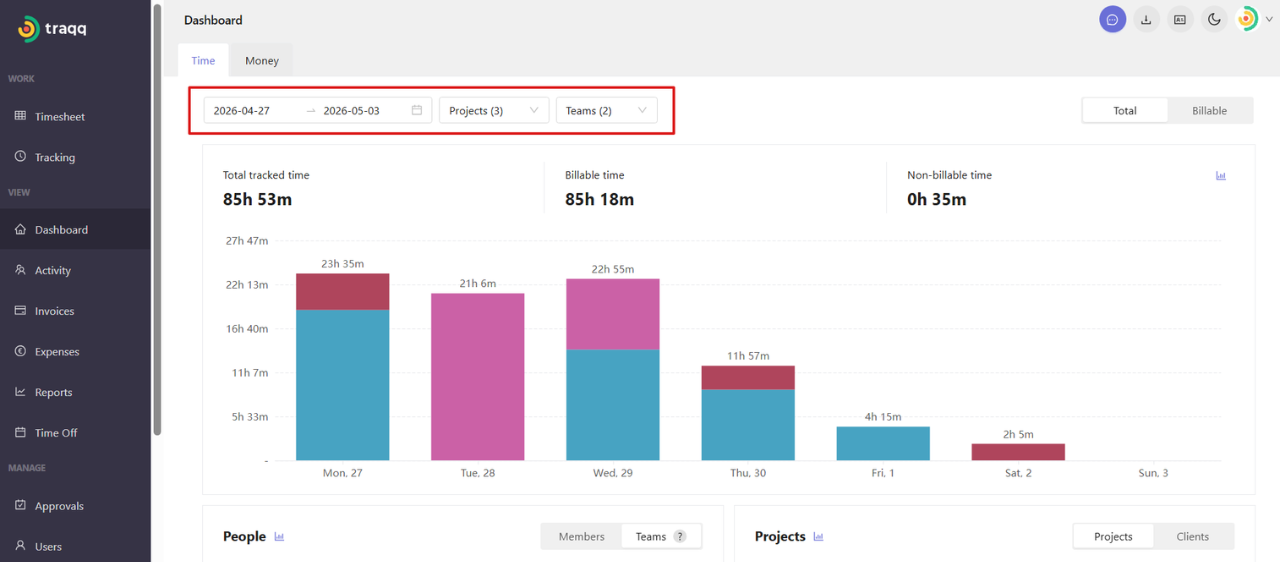
You can filter the data by:
Date range — select the reporting period
Projects — select one, several, or all projects
Teams — view specific teams or all teams
In the upper-right corner, you can choose how time is displayed:
Total — all tracked time
Billable — only billable hours.
Breakdown by People and Projects
Pie charts below the bar chart show how time is distributed across people and projects. You can switch between Members / Teams and Projects / Clients using the controls above each chart.
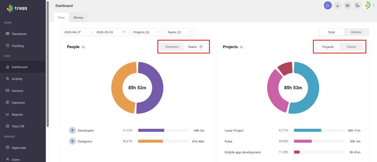
For teams, total worked time may not match the sum of team hours if some users belong to multiple teams.
Money tab
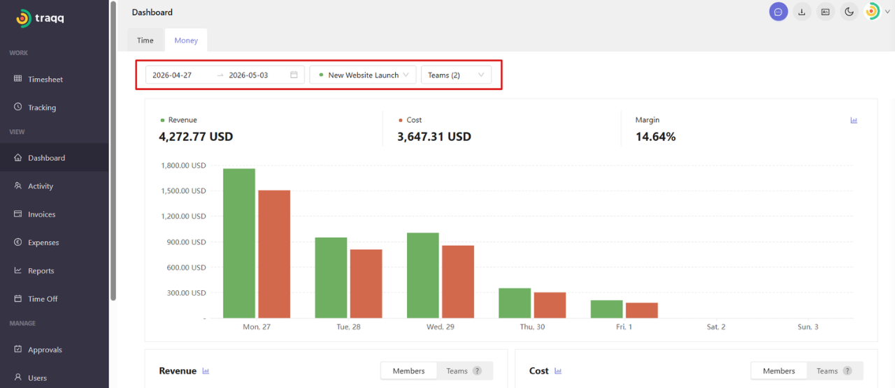
The Money tab shows financial data based on tracked time, employee rates, and project costs.
At the top of the page, you will see revenue, cost, and margin. A bar chart shows revenue and costs for each time period.
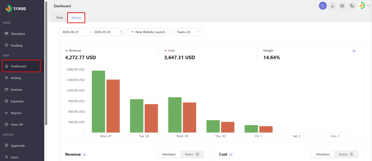
You can select one Project to view its financial data and choose one or multiple Teams to include in the report.
Breakdown by Members and Teams
Pie charts show how revenue and cost are distributed across your workspace. You can switch between Members and Teams to change how the data is grouped.
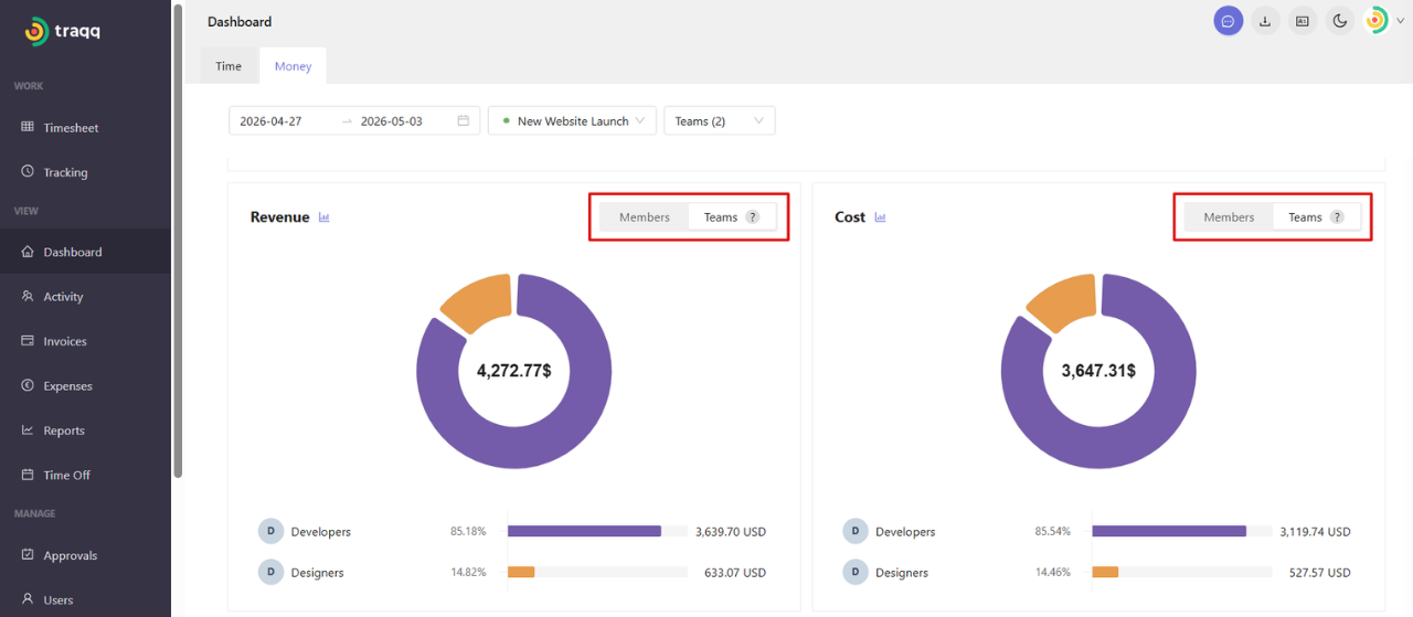
For teams, total values may not match the sum of team data if some users belong to multiple teams.