Do you like landing on a 404 page when browsing the web? We bet you wouldn’t mind it a bit if you came across some of the cool 404 page examples we’ve collected here. To make the 404 error less of a bummer for site visitors, web developers use all the wit, the clever design and the most unique messages they can come up with. If you have your own website and need ideas for a creative 404 page, this list is just what you’ve been looking for. See how others use sharp content or some thoughtful yet simple CSS animations to relieve the frustration of landing on an error page for their visitors.
Here are some of the best 404 pages to get you inspired:
Pixar
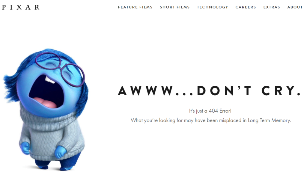
Of course, Pixar knows what it does best—tugging at people’s heartstrings. Don’t take the 404 error to heart as Sadness does! As Pixar says on the page, what you’re looking for may have been misplaced in Long Term Memory.
Mantra Labs

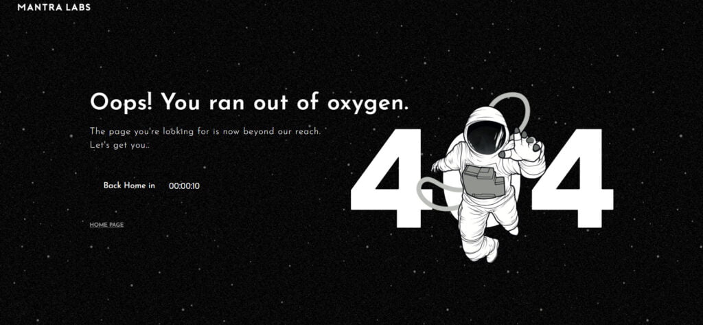
Mantra Labs’ custom 404 page is simple yet interesting. There’s an animated illustration of an astronaut floating into the ‘404’ text, with an accompanying message which says, “The page you’re looking for is now beyond our reach.” There’s a homepage link on it, but it automatically redirects to that page within ten seconds.
Dan Woodger
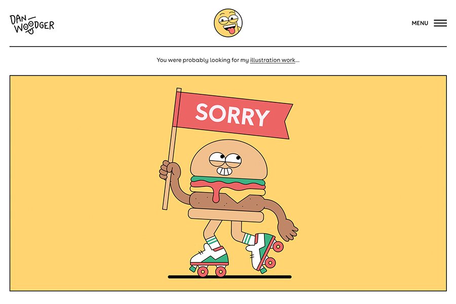
If a picture paints a thousand words, then Dan Woodger’s 404 page is the perfect example. There is a cute illustration of a hamburger on roller skates. It’s carrying a ‘sorry’ flag, indicating that the visitor got lost and landed on a 404 error. It’s not overly creative, but it’s witty enough to get you over the problem. What’s more, it is genuinely reflective of the overall theme and mood of the site.
Traqq

Take Traqq’s 404 page as an example of minimalism. It features a lite design with a simple yet concise explanation of the 404 error. It also illustrates what the visitor can do in case the error has to do with a server issue. Finally, it includes a link to Traqq’s Time Tracker homepage which helps the user find the information they need.
Drift
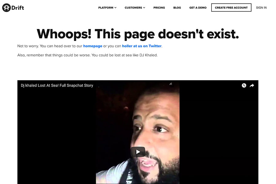
You can lighten the mood by surprising the visitor with some witty content. Take Drift as an example. The company explained the scenario. To make the experience humorous for the visitor, Drift embedded a video of DJ Khaled lost at sea. You’d feel better about a 404 page when you see that your situation is not as bad as DJ Khaled’s.
Omelet
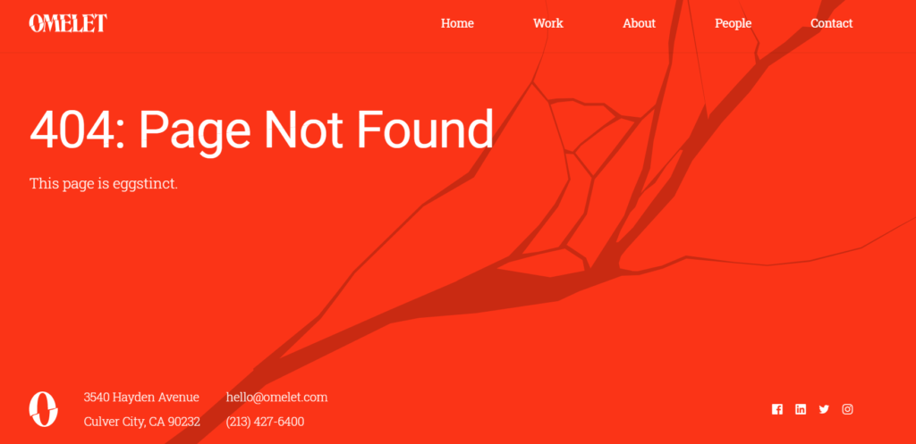
Do you love puns? Well, get inspiration from how Omelet used a play on words to make their 404 page witty. There’s an animated crack introducing the visitor to the page, then it features a message which says, “The page is eggstinct.” Deliciously funny! There is also a minimalist navigation bar at the top, allowing the visitor to find the page that they need.
9Gag
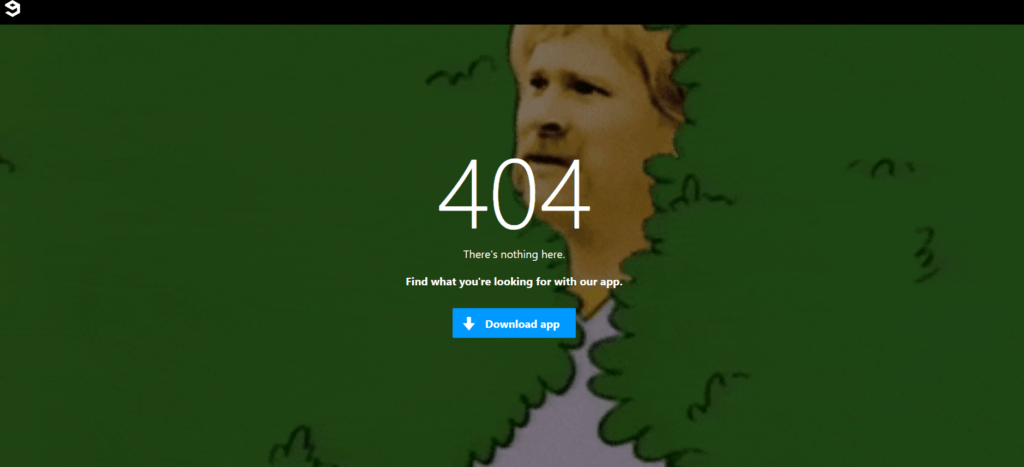
9Gag knows how to be funny without overdoing it. Its 404 page features a gif of a confused man mouthing the phrase, “What the f**k?” This page was funnier when it had a confused John Travolta as its mascot, but this one still gets the joke across.
Ready to Go Survival
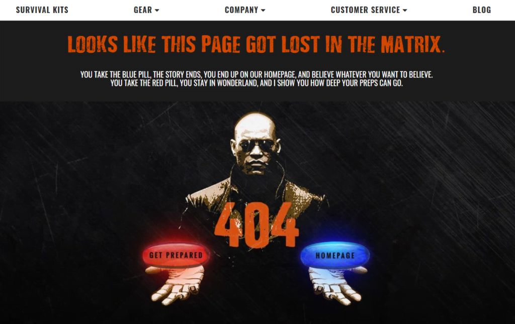
Who doesn’t love to see movie references within a 404 page? While most people get bummed when they see errors like this, Ready to Go Survival makes the experience interesting by featuring Morpheus from The Matrix. The content will get you so curious that you’ll forget you landed on a 404 page. You can click on the Red Pill or the Blue Pill, but either way, your choice will keep you browsing through the site.
Flywheel
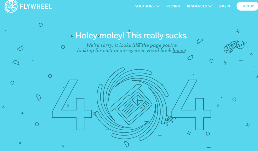
Now, if you hate gimmicks and you prefer a simple, beautiful design, you’ll love Flywheel’s 404 page. It effectively incorporates a minimalist style while using sharp humor. It is perfect for its designer-oriented visitors. It’s funny how they designed the ‘0’ like a black hole. Flywheel doesn’t try too hard to jest, which makes the page more interesting.
Ueno
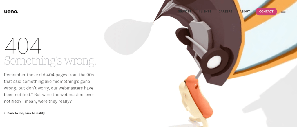
This screenshot does not do justice in the amount of effort and thought that Ueno put into its 404 page. The animated hotdog runs through an infinite loop of a surreal environment. The explanatory text is also hilarious, making it quite interesting. Let’s face it. Do we really believe that webmasters were notified of 404 pages in the 90s?
Slack
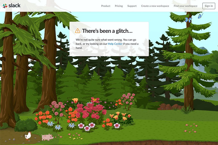
Slack effectively distracts the visitors from the frustration that comes from a 404 error. While the explanatory text is straightforward, the page’s visuals are unique. It’s funny because it’s quite unusual. You will see a dream-like environment where little islands float over farm animals that walk freely in a lush forest. It gets the message across—you are truly lost.
Comedy Central

No one handles humor better than Comedy Central. It can be tricky to use sarcasm in a 404 page, but this site executed it effectively. Now, if you’re frustrated that you cannot find the content you need, you can simply scroll down and watch the site’s recommended shows. You might end up laughing your frustration off.
There are plenty of other effective and witty 404 pages out there. It’s not easy to create a humorous yet practical page. Even big brands with deep pockets can fail at it. However, we hope that our list and examples give you the inspiration to create a custom 404 page that truly speaks your personality and brand.
